The same design, with less to fill in
Each app below was written the way a code generator tends to write it. Phyll reviewed the first version, and the second applies the review without changing colors, gradients or components. Each image shows the same moment in both versions: before on the left, after on the right.
Replyloop is in English. The other three are Brazilian businesses, so their screens are in Portuguese.
The numbers of the first job
| App | Fields | Clicks | AI tell index | Style kept |
|---|---|---|---|---|
| Replyloop | 9 → 2 | 9 → 3 | 75 → 7 | 10 of 10 traits |
| Navalha Barbearia | 20 → 4 | 18 → 4 | 54 → 6 | 9 of 9 traits |
| Orça Já | 41 → 4 | 10 → 2 | 66 → 6 | 9 of 10 traits |
| Brasa Burger | 33 → 4 | 15 → 5 | 53 → 6 | 8 of 8 traits |
Fields and clicks count what a first-time user had to do for the first job, and none of the before versions got that person to the result. The index comes from scanning the code, and lower is better. Style kept counts the visual traits of the before version, such as gradients, glass and emoji, that are still in the after version. The one trait Orça Já lost was a badge that promised artificial intelligence the app did not have.
Replyloop
Automatic DMs for everyone who comments a keyword on Instagram.
Send a DM to everyone who comments a keyword
First screen
The headline promised “Supercharge your Instagram with AI-powered automation”. Now it says what the app does: send a DM to everyone who comments a keyword. The AI badge now announces a feature that exists, a test DM to your own profile, and the stock avatars are gone.
- P01The first screen does not say what this is or what to do
- C01Generic value-proposition phrases
- C03Invented social proof and numbers
- C04Placeholder people and data left in

Creating an automation
Nine fields, with codes like COMMENT_KEYWORD and page_1784140, became two: the keyword and the message, with a preview of the DM beside them. Trigger, account, delay and status got defaults, the name moved to “More options”, and description and tags are gone.
- F02Everything asked up front
- F09Options the system could decide
- C05Code words on screen

Right after creating
Before, a bouncing “Success!” and the automation marked ACTIVE with no Instagram connected. After, the screen says the automation is ready and offers the next step: a test on your own profile and connecting Instagram.
- S04Success that leaves no trace
- F04A dead end after success

Empty list
“No data” became a sentence that explains what an automation is, with a button to create the first one. The five “Coming soon” items left the menu.
- S01Empty states that only say no data
- P05Features that do not exist yet

Connecting Instagram
Four fields of Meta developer credentials, such as an access token and an app secret, became one button to sign in with Instagram. People who make content do not have those credentials.
- F05Sign-up or setup before the first result

On a phone
The before version shrank the whole desktop screen. The after version swaps the sidebar for tabs at the top, which wrap to two lines so all four show.
- S05Breaks on a phone

Navalha Barbearia
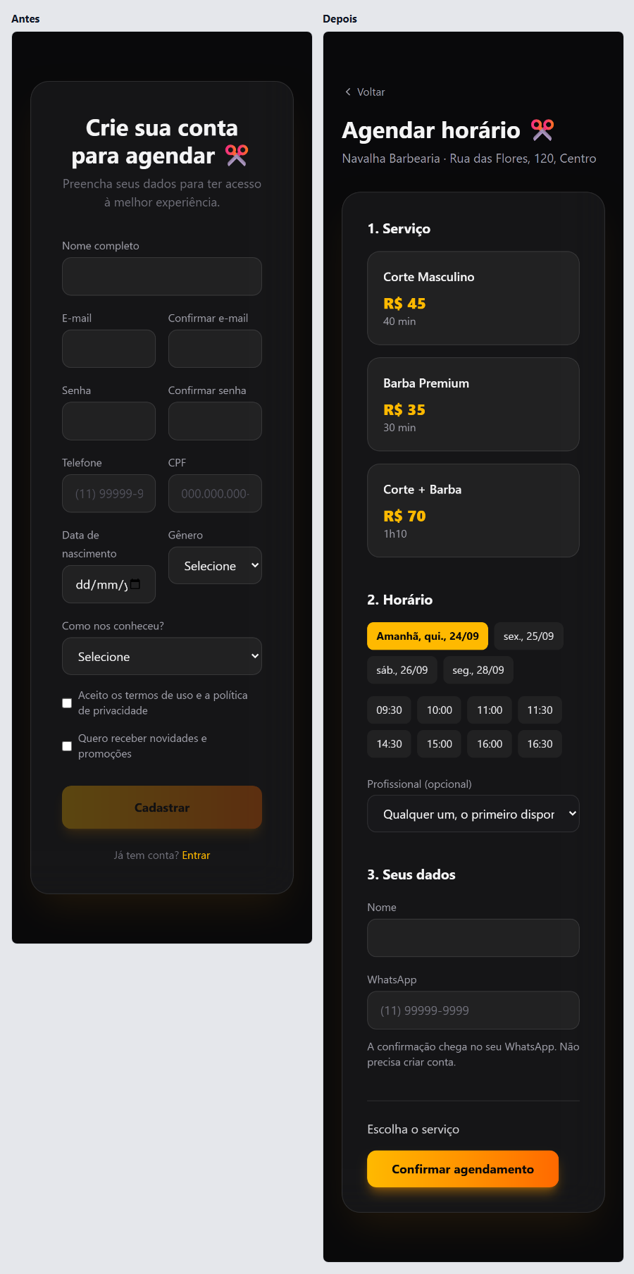
A barbershop's site to book a haircut and a beard trim. Dark background, amber gradient and glass, all kept in the after version.
Book a haircut
The first click
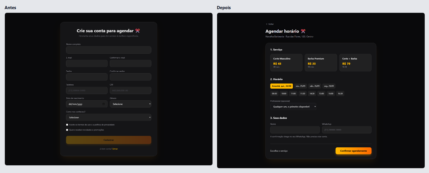
“Book now” opened a 12-field sign-up, with a CPF (Brazil's tax ID), gender and the password twice. Now it opens the whole booking on one page: service, day and time, name and WhatsApp.
- F05Sign-up or setup before the first result
- F11Personal data the job does not use
- F12Asking for the same thing twice
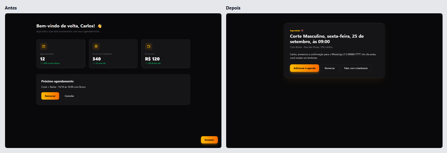
After booking
The customer booked a men's haircut on the 24th with Rafael, and the account showed a different appointment, on October 15 with Bruno. The new confirmation shows what was booked and offers to add it to the calendar, reschedule and message the barbershop.
- S04Success that leaves no trace
- P03A dashboard of zeros or invented numbers for a new user
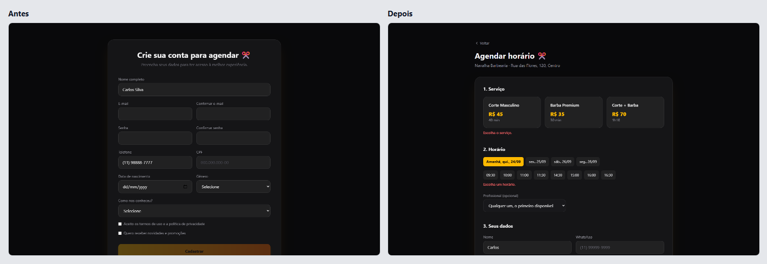
When a field is missing
With name and phone filled in, “Sign up” stayed greyed out and nothing said why. The new button works, each field says what is missing, and the page scrolls to the first problem.
- A07Disabled buttons that do not say why
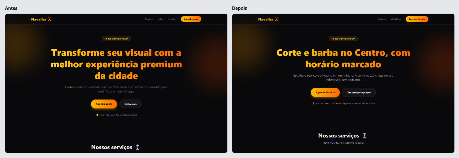
First screen
“Transform your look with the best premium experience in town” became “Haircut and beard downtown, by appointment”. The 4.9 rating with no source gave way to the address and the opening hours.
- C01Generic value-proposition phrases
- C03Invented social proof and numbers
On a phone
On a phone, the sign-up came before anything else. Now the first tap shows the services with prices, and the day starts on the first one with a free slot.
- F05Sign-up or setup before the first result
- F09Options the system could decide
Orça Já
Quotes for service providers and small shops. White, an indigo and violet gradient and cards with shadows, all kept in the after version.
Write a quote and send it to the client
Writing the quote
Step 1 of 6 asked for your company's legal name, tax ID, full address and logo, on every quote. Now one page asks for your name, the client and the items, and the document builds itself beside them as you type.
- F02Everything asked up front
- F07A wizard for a one-screen task
- F11Personal data the job does not use

After creating it
The finished quote became a DRAFT in a list, with no button to send it. Now WhatsApp opens with the message ready, and the page says the next step: mark it when the client approves.
- F04A dead end after success
- C05Code words on screen

The list
The list started with João da Silva, Maria Oliveira and Empresa XYZ, with statuses in English, like PENDING, in an app in Portuguese. The new list shows only the person's own quotes, with statuses in Portuguese and the actions always in view.
- C04Placeholder people and data left in
- C08Two languages in one interface
- A05Actions that only appear on hover

First screen
“Revolutionize the way you create quotes” became “Make the quote and send it on WhatsApp in a minute”. The badge promised artificial intelligence, which the app does not have, and now says “Free, no sign-up”.
- C01Generic value-proposition phrases
- C03Invented social proof and numbers

On a phone
The sidebar took half of the phone, and the wizard's fields were a few pixels wide. In the after version the form stacks, and quantity and price have labels.
- S05Breaks on a phone

Brasa Burger
A burger place's menu with delivery. Orange, red and emoji, all kept in the after version, with the buttons' gradient starting on a deeper orange so the white text is readable.
Order a burger for delivery
Adding a soda
The same options modal opened for every item, and asked how the meat should be cooked for a can of soda. Now the drink goes straight into the bag, which stays in view.
- F03A modal for everything
- F09Options the system could decide

Adding a burger
“Add” opened a modal with doneness and bun required and nothing chosen. Now the burger goes into the bag medium, on brioche, and anyone who wants to change it uses “Customize”.
- F09Options the system could decide
- A07Disabled buttons that do not say why

Checking out
The checkout had 20 fields, with the address in seven parts and a card number with CVV, though the site charges nothing. The new one asks for the address, name, WhatsApp and how you pay on delivery.
- F02Everything asked up front
- F11Personal data the job does not use
- F12Asking for the same thing twice

After ordering
After checking out, the site went back to the home page with a success notice. The after version shows the order number, the delivery estimate and the shop's WhatsApp.
- F04A dead end after success
- S04Success that leaves no trace

On a phone
Three columns squeezed the cards, with one word per line and prices running off the edge. Now there is one column, and the bag sits in a bar fixed at the bottom.
- S05Breaks on a phone

Try it on your app
The scanner finds these tells in your code, with no account. The full review runs in Codex or Claude Code and fixes the flows without touching your design.
npx phyll scan